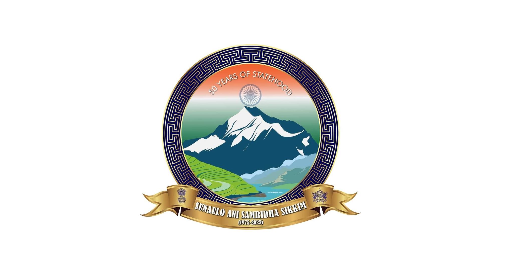

Gangtok, 15 August : The Chief Minister today unveiled the official logo and jingle to mark 50 years of Sikkim’s statehood, developed by the Information and Public Relations Department. This emblem, rich in symbolism and pride, will represent us across all platforms throughout this momentous celebratory year.
The special logo marks the 50th anniversary of our journey, capturing the essence of Sikkim’s cultural richness, natural splendour , and deep-rooted values. Each element has been meticulously selected to reflect the spirit and pride of Sikkim.
1. Gya-nak-chari Motif: Encircling the logo is the Gya-nak-chari motif, a design emblematic of wisdom and protection in the Himalayan heritage. This sacred symbol forms a protective ring around the logo, representing the cultural and historical continuity that has safeguarded Sikkim’s identity for half a century. Its circular shape is a nod to the unity and enduring spirit of the Sikkimese people.
2. Mount Khangchendzonga: Central to the design is Mount Khangchendzonga, not just a mountain but a revered guardian deity in Sikkim. As the third highest peak in the world, it epitomises the strength, resilience, and spiritual depth that have been integral to Sikkim’s story. The mountain stands tall within the logo, symbolising the unshakable foundation upon which the state’s legacy is built.
3. Rice Paddy Fields: The depiction of rice paddy fields underscores Sikkim’s agricultural heritage and its pioneering commitment to organic farming. These fields are a symbol of fertility, prosperity, and the symbiotic relationship between the land and its people. They remind us of the state’s dedication to sustainable growth and its respect for nature.
4. Indian Flag in the Background: The Indian flag, with its iconic tricolor, forms the background of the logo, affirming Sikkim’s integral place within the Indian Union. The flag’s colors—saffron, white, and green—echo the ideals of courage, peace, and fertility, while the Ashoka Chakra symbolizes the relentless pursuit of progress. This backdrop celebrates Sikkim’s contributions to the nation over the past 50 years.
5. River Teesta: The River Teesta flows gracefully across the logo, representing the lifeblood of Sikkim. This river is more than just a geographical feature; it’s a symbol of continuity, life, and the natural bounty that Sikkim enjoys. Its presence in the logo highlights the state’s deep connection to its natural environment and its role in nurturing both its people and its land.
6. National Emblem : Anchoring the logo is the national emblem, bearing the words ‘Satyamev Jayate’ meaning Truth Alone Triumphs. This emblem connects Sikkim to the larger ideals of truth, justice, and integrity that define India. It serves as a reminder of the principles that have guided Sikkim through its 50-year journey, and its commitment to upholding these values in the future.
7. Khamsum Wangdu: The ‘Khamsum Wangdu,’ a singular symbol of Sikkimese identity, embodies the unique spirit and heritage of Sikkim. As the state’s distinct crest, it stands not only as a symbol of victory and accomplishment but also as a powerful representation of Sikkim’s journey over the past five decades. The emblem is a testament to the state’s success and progress, while also serving as a beacon of hope and aspiration for the future, guiding Sikkim toward the next 50 years with pride and determination.